Case studies show that accessible websites have better search results, reduced maintenance costs, and increased audience reach, among other benefits.
~ W3C: The case for web accessibility
Library websites and library buildings are required by law to be accessible to persons with disabilities. If you would like assistance with an assessment of your library website or building, contact sharon@sckls.info.
According to this CDC infographic, roughly 1 in 4 adults in the US live with a disability of some kind. These include issues with mobility (physical movement), cognition (some examples are dyslexia and short-term memory loss), hearing and vision impairments.
Awareness of things like color contrast, text size and other design features will help you build accessibility into your design and content. Scroll down for information on common barriers and tips for correcting those problems.
Taking these actions WILL NOT make your website compliant with all WCAG guidelines! This information is intended as a starting place on your journey toward meeting accessibility standards.
For more information, and to see these topics in action, watch our 25-minute webcast Working Toward Website Accessibility.
Color Contrast
All content – and especially text – must have high enough contrast to be easily discernible.
Sample text to test color contrast – virtually unreadable.
Use a color contrast checker to see if yours meets the standard, and do some tweaking if it doesn’t.
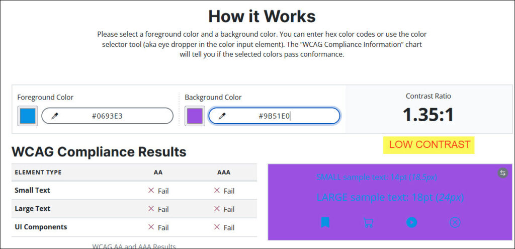
The MINIMUM is a 4.5:1 contrast ratio, but higher is better! Darken one color and lighten the other for a much better result.
Sample text to test color contrast – easy to read!
Contrast in Text Over an Image
In the WordPress block editor, changing an image block to a cover block automatically adds an overlay.
It’s easy to change the text color and/or overlay color and opacity so the image and text combination is pleasing and legible.
Compare the two examples below; the only difference is the position of the text block, but it is critical for easy readability.

Text Over an Image
(cover block)

Text Over an Image
(cover block)
Color Elements
Not everyone sees colors the same way! Be sure that information or instructions are not conveyed by color ONLY. An estimated 7% to 8% of the population have some kind of color blindness.
Use a color blindness simulator to approximate the color perception of people with various conditions. Just drag and drop an image or screenshot to view it several different ways. As shown in this example, some users would not be able to tell which button to click without a text label.


Adding text makes it easier for everyone!


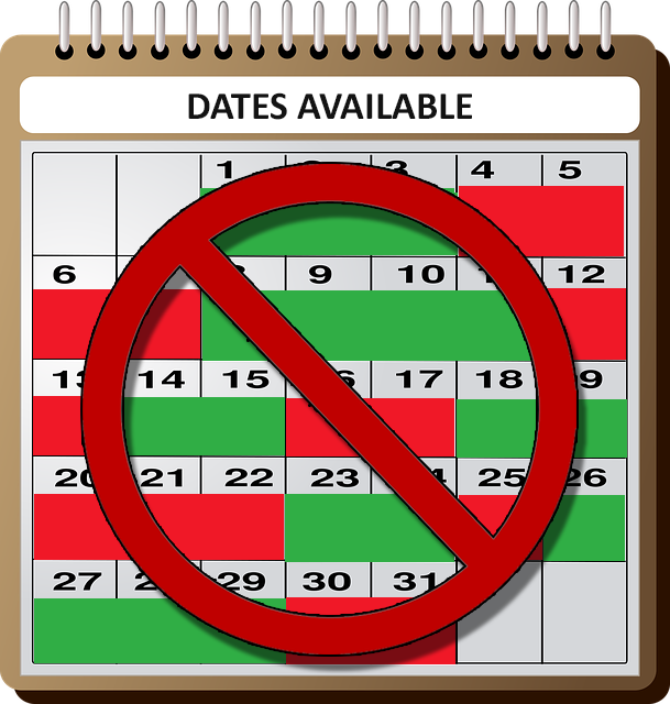
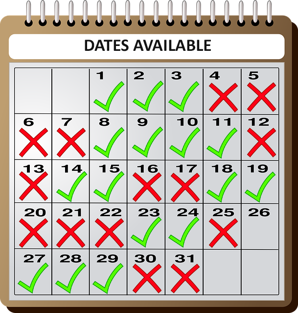
Where you don’t use text, symbols AND colors used together work well to get the message across quickly. It’s easy to see at a glance which of these calendars is easier to understand.
Text and Fonts
Font size and style are other important factors in readability.
Use a medium text size (this is 20 point) and adjust if needed. Fine print should be for legal documents, not websites!
If you have text blocks longer than one line, be sure the text is left-aligned, not centered – it’s much easier on the eyes to start each line at the same place. The following paragraph illustrates the difference it makes.
Use a medium text size (this is 20 point) and adjust if needed. Fine print should be for legal documents, not websites!
If you have text blocks longer than one line, be sure the text is left-aligned, not centered – it’s much easier on the eyes to start each line at the same place.
This paragraph illustrates the difference it makes.
Also, it’s good practice to allow users control over text size, without having to zoom the whole site.
This website uses an accessibility plugin that provides the option to enlarge the text or to switch the site to a high-contrast color scheme with a black background. This comes from the same plugin that helps correct those behind-the-scenes accessibility issues that improved the score in our example website in the “Working Toward Website Accessibility” video.
Beware of Fancy Fonts
Decorative fonts can be fun, but they can also be hard for some people – and screen readers – to decipher.
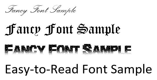
While it’s great to have a special font for your logo, don’t use a non-standard font for your site’s main content.
Easy legibility is key!! Not only screen readers, but actual people may have problems deciphering fancy script or other fonts.
Don’t make reading hard. If you DO decide to use special fonts here and there, make very sure that the same information is nearby in plain text.
Headings
…providing a heading structure is important to screen reader users, with 76% always or often navigating by headings when they are available.
https://webaim.org/projects/screenreadersurvey/#headings
Most people don’t think much about headings in their web pages or posts (if they use them at all), but it’s a different story with screen readers.
They look at the code behind the text, and recognize that the header <h1> is the page title, <h2> is a main section, <h3> is a subsection, and so forth – providing structure in much the same way as an outline.
The proper use of headings basically creates an ‘index’, so users with screen readers can skim through a page to the section they’re interested in, rather than having to listen to the whole thing word for word.
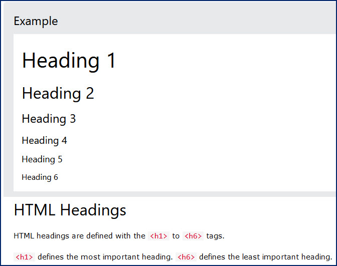
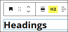
Do be sure to choose your headings in descending sizes, and do jump back up to the <h2> level for the next main section.
Do not just bold regular text for section headings!
Descriptive Links
Don’t use ‘click here’ or something equally uninformative for your link text! This also applies to buttons, as seen in the Color Elements section above.
Site users should be able to know ahead of time what’s at the other end of that click.
Screen readers may read out just a list of links on a page, so be sure the destination is clear even if the link text is read out of context, or if the links are read in a list.

Visit the SCKLS website for news, events and information for member libraries.
Webcasts and webinar recordings are freely available on our Training Videos and Handouts page.
Alt Text
Images on websites add SO much – and it’s unfair to leave visually impaired site users out of the loop. Taking just a few moments to add alternate text to images helps them literally ‘get the picture’.
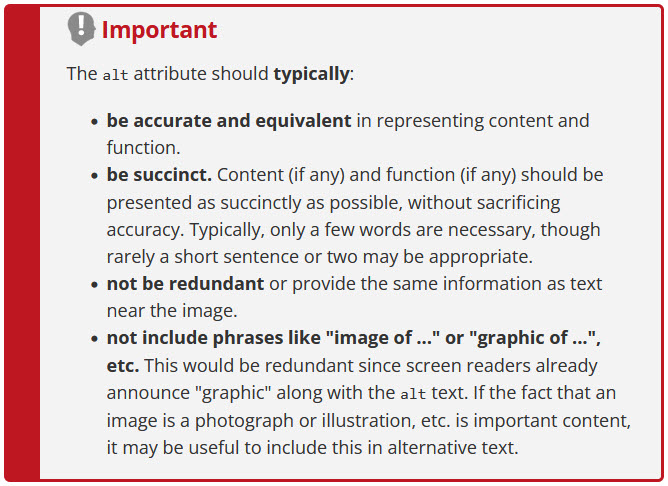
Alt text (as it is often called) is usually a not-too-lengthy description of what is depicted in the picture. It doesn’t show up on the front end, but allows screen readers to communicate an image verbally.
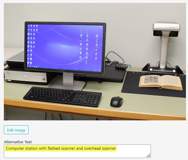
Once you determine that an image is not purely decorative (in that case, leave the field blank), get helpful tips at WebAIM’s alt text page.
Text Over Images
If you have text in an image, is that same information in plain text nearby?
Text that is part of an image is still just an image. Even when you put it in the alt text field, be sure to restate the information in plain, eye-readable text so ALL users will get the point, even if the image doesn’t load for some reason.

Access Mango Languages free from the library website and start learning a new language!
Animation
Animated elements may need to have user controls.
Avoid the use of flashing or blinking content or other animations, especially if their only function is to get attention.

If there is any moving, blinking, or scrolling information that starts automatically and lasts more than five seconds, there should be a way for the user to control or stop it.
For example, if you use image carousels or sliders, it’s best to set them to change at slow intervals, or to let users click to advance them manually.
No content should flash or blink more than three times in one second – if so, it needs to be corrected to prevent the possibility of triggering seizures in people who have photosensitive epilepsy.
Keyboard Navigation
Many people cannot use a mouse for one reason or another, and navigate using just the keyboard.
Can you move through your website using the tab and enter keys? Try navigating without a mouse and see how well it works! Web AIM has a good chart of keyboard shortcuts you can use to test your page.
Is there a way to tell visually where you are on the page? We appreciate a change when hovering with a mouse, but a keyboard user needs a different way to determine their page location.

Two examples of keyboard focus with a yellow box outline.
Forms
When you create an online form, think about accessibility from the very beginning!
For even the most basic form, be sure to add descriptive field labels, plus informative placeholder text if you have that option.
Be sure that your form maker provides a clear error message for fields that are skipped or filled incorrectly – not just a red outline!

A plain red box doesn’t provide any information on what went wrong.

But it’s clear here what needs to be corrected!
Captions
Make sure that any videos have synchronized captioning. This is useful for both hearing impaired people AND for the large majority of viewers with excellent hearing who choose to turn off the sound.
Whether it’s a YouTube video or some other platform, it should provide you with a way to create captioning.
Automatic captioning is a great way to start, but as we have learned here at SCKLS, that can go very wrong – so be sure that an actual human reviews and corrects it!
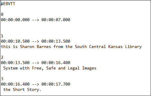
It’s easy to use Notepad to edit a plain text caption file, then upload the corrected file to your video hosting platform.
Language Barriers
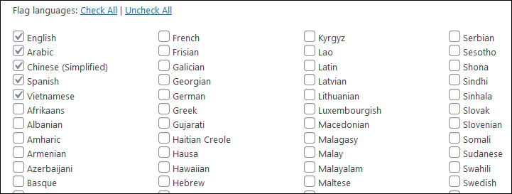
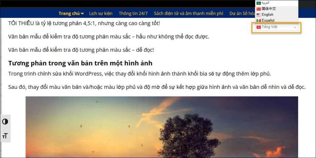
Finally, while it’s not in the same category as the previous accessibility issues, language can certainly be a barrier for non-English speakers.
Do your homework to find out what languages are spoken in your area; additional demographic statistics you may find (older adults? families with small children?) can help you identify services that might be of interest to them.
Contact sharon@sckls.info for more information, and prepare a list of language options that will fit your community’s needs.
In Conclusion…
The practical bottom line is that between the simple but critical actions outlined here and the use of a good plugin for some code corrections, you can move your site from a failing score – and more importantly, from failing your community – up the scale to a much more usable format for all your potential users!
